Saturday, October 29, 2011
Saturday, October 22, 2011
Final design
It is way better and clearly readable.

Font issue
But Smriti advised to use a serif font because that would go better with my illustration and said it doesn't matter if I use a separate font only on the map.

One more feedback was to change the header title 'chasing the cultural monolith' as it is too academic and not creating any interesting positive impact on the viewer. So I had been told to think something poetic and simple.
Final chosen one

But now the main concern is the readability issue on the map. The font I chose has an essence of linoleum print and very well working with the kind of style I used for the illustration. But I figured that it is hardly readable on this colour. My panel suggested to use a regular font. That would be clearly be distinguished from the blocks I have on the map.
Colour options
Feedbacks
So they advised me to try out with some browns, greys and also to reduce the black and see what happens. Basically to make it a bit subdued.
also they pointed out that in the category list its no point keeping map there....it should be home instead of map. I wanted to animate the rickshaw on the pathway on the map just to make the viewer understand that there is a main road surronded by the campus and for fun sake. but panel members said it is not necessary and it would look gimmicky. But to keep the rickshaw as an element of the design because rickshaw plays an important role in Santiniketan.

Wednesday, October 19, 2011
Project Title options
1. Kala Bhavana: A Heritage of Innovation
2. The Journal of a Magical School
3. Recording an Inanimate Legacy
4. Kala Bhavana: The Anti – establishmentarian Establishment
5. Chasing the Cultural Monolith
6. Kala Bhavana: The cradle of the Traditionists and the Iconoclasts
Monday, October 17, 2011
Website Design: Final
The previous design was going on a bit wrong direction.
First of all, I realized that designs and visuals derived following Rabindranath Tagore's drawing style had been done to death. So whichever direction my design would have taken it would surely have missed that factor of uniqueness to it.
Although using Tagore's personal drawing style was not a bad idea though, because after all Tagore was the master mind behind the whole concept of alternative education system practiced in Visva Bharati, so there is one direct connection and hence relevance to the design, but this Tagore connection applies as a whole to Visva Bharati school of education, whereas here I should be talking more specifically on the art department, that is the Kala Bhavana.
On the other hand Nandalal Bose was a founder member and one of the very central personalities of Kala Bhavana. He developed and practiced a certain form of art that defined Kala Bhavana. Form and content wise which was totally different from the European school of art practiced by even the ace artists of that period. For example, where as maestro painters like Raja Ravi Verma has painted Sita standing in the very much European posture of Venus, Nandalal also would take his subjects from hardcore Indian mythology, but was able to introduce the very much Indian style of anatomy and iconography in his paintings. This, he and his associates derived by conducting extensive study tours from Kalabhavana to the historical places rich in examples of Indian classical art, like Ajanta, Ellora, Saranath, etc. But their style not only directly represented the classical style, but it was an unique form consisting parts of the lovely traditional art forms on the verge of extinction (e.g. the Kalighat pata painting style). This soon became the very essence of Kalabhavana's art language. And the best part is, they didn't only derived the subjects of their paintings from Indian mythology, but they also applied this same style to portray the simple village tribes and their activities they used to see around them everyday in Santiniketan. So content wise as well this style became unique.
As the whole point of my work is to introduce people to this essence of art practiced in Kalabhavana, through a tour of its exhibits, so I thought this style to be appropriate for conveying this idea.
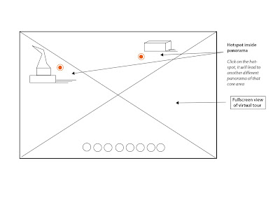
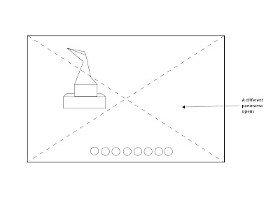
Since the map of the area is the most important element of my design, I decided to keep the map interactive and at the spotlight of the design. The map will lead to different panoramas of the exhibits, as well as it will take the viewer to different parts of the website, which will give information about the exhibits and their artists.

Wednesday, October 12, 2011
Website design: Concept 2

In the zeal of reviving Bengal school of art, Nandalal Bose developed his own unique style of painting and versatility, sharp contrast of black and white, drawing style in linocuts,and the unique usage of black at the edge of the painting as if forming a border had its own essence, which later followed by a lot of learners in Kala Bhavana. Nandalal being one of the most celebrated creator of kala Bhavana, his huge body of art and his own created styles and techniques became famous.
So I tried to draw out the physical map of Kala Bhavana adapting Bose's style of linocut painting. The reason because I kept the map on my home page is, from the map I have all the information flow of the website. The map is the most important element here.
Inspirations: Illustrations by Nandalal Bose from 'Sahaj Path',Bengali primer,written by Rabindranath Tagore


Monday, October 10, 2011
Website design: Concept 1 Refinement
Website design: Concept 1
So I thought in the same way while putting my ideas down while conceptualizing the website design for my project. So initially I thought of using Tagore's personal style of scribbling and illustrations.


Thursday, October 6, 2011
Final Panorama 6:'Buddha' sculpture by Ramkinkar Baij
I could solve a major problem of setting a zoom limit when you are navigating through the panorama.Earlier the viewing parameter was limitless, no set value was given for the minimum field of view, so you could zoom in until it was getting fully blurred.Obviously that is not a very good experience. I was trying to figure out a way so that the viewer can only zoom in to a certain level and then when he/she wants to see more detail view of the sculpture/mural, can always click on the option button and experience it.
So that is solved now. you can see the difference in this one if you go to the previous panorama of Gandhi I uploaded here.
Wednesday, October 5, 2011
Monday, October 3, 2011
Mood Boards and Colour Palette for the website

Mood Board 2: This one reflects the overall mood and the feel of the campus. I have kept almost all the murals, sculptures and the buildings that are present inside Kala Bhavana to get the idea of the tone and the visual language of the space.

Colour Palette

Fianl Panorama 3: Mural of Somnath Hore on the wall of Graphics Dept.
File size is becoming a big problem over here. Each time I stitch a panorama, the resultant images are huge! This is not very suitable for Indian internet speed. So right now I am scaling down the images a bit. But this is making the image quality suffer to some extent. But this won't be much of a problem, as it will serve the purpose for the viewer to perceive the environment. To examine the art objects in detail, there will be a separate window linked to the panorama. Which means, when one goes through the panorama, and then sees a particular art object in the environment, he or she can click a button attached to it, and can check out a detailed view of the object, in a new window.


